The client
World Vision is the world’s largest international children’s charity. A global partnership conducting child-focused emergency relief, sustainable community development and advocacy in 92 countries worldwide.
The objective
World Vision France approached me to completely redesign their site. At the time the site was outdated both visually and technically, which was causing them to lose new sponsors during the long and complicating sign-up process.
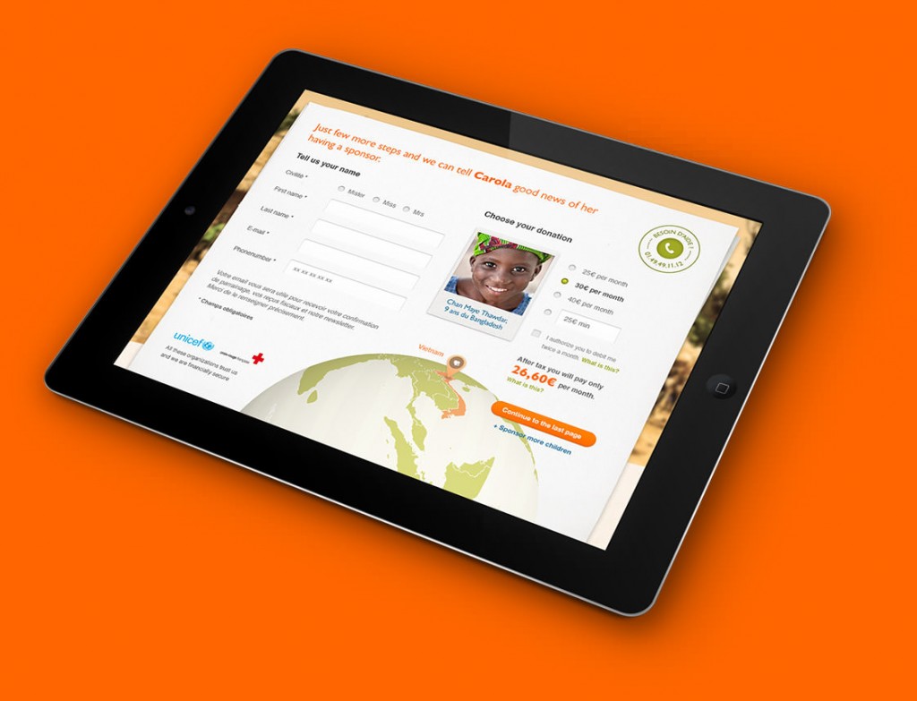
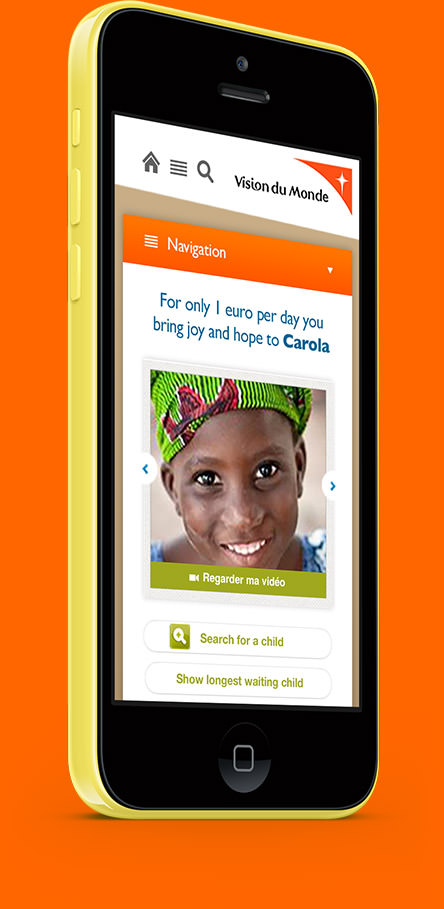
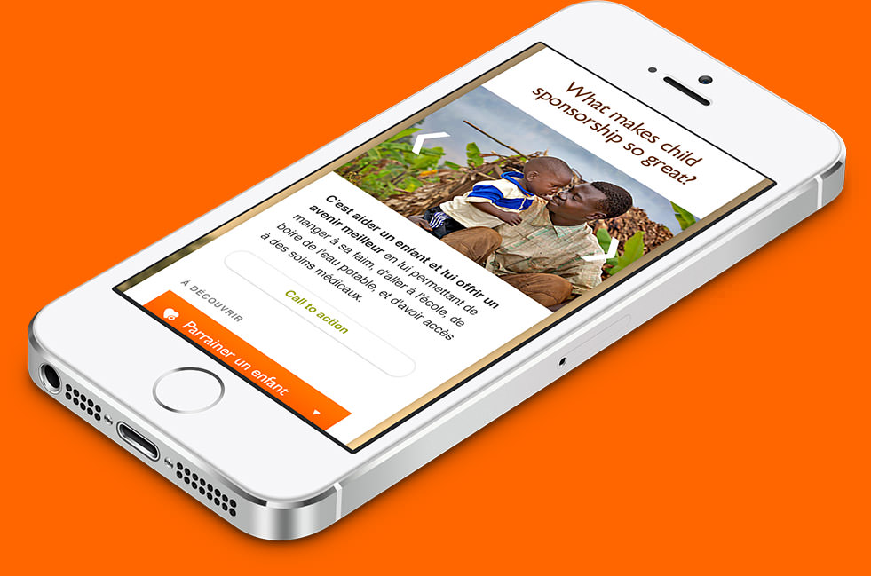
The main goal for the new design was to make the sponsorship funnel easier and more visually engaging for educated women in their 30s. They also aimed to improve the overall user experience through powerful images, good typography and a user-friendly grid.
The (long) story
The brief was very extensive but at the same time open for new ideas. The team consisted of an international group – the client in Paris, a head of development in Seattle, a project manager in London, a few developers in India and a digital media marketer in Helsinki. I was living in Madrid at the time, so we had to work with quite a range of different time zones and accents. Work began in March 2012.
I started studying carefully the current site and their strict brand guidelines in order to gain a better understanding of what I could and couldn’t do from a design perspective. The platform for the site would be Drupal 7. For the visual approach, I designed five different mood boards to showcase different looks and feels for the site.
Once the visual direction was chosen, I fired up PhotoShop. Digital media marketer Ilkka Koivisto was responsible for wireframing, so my task was to follow doodly Mockingbird mock-ups and convert them into up to date layouts.
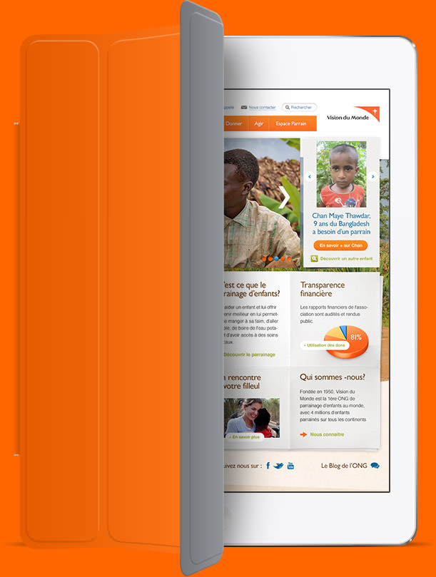
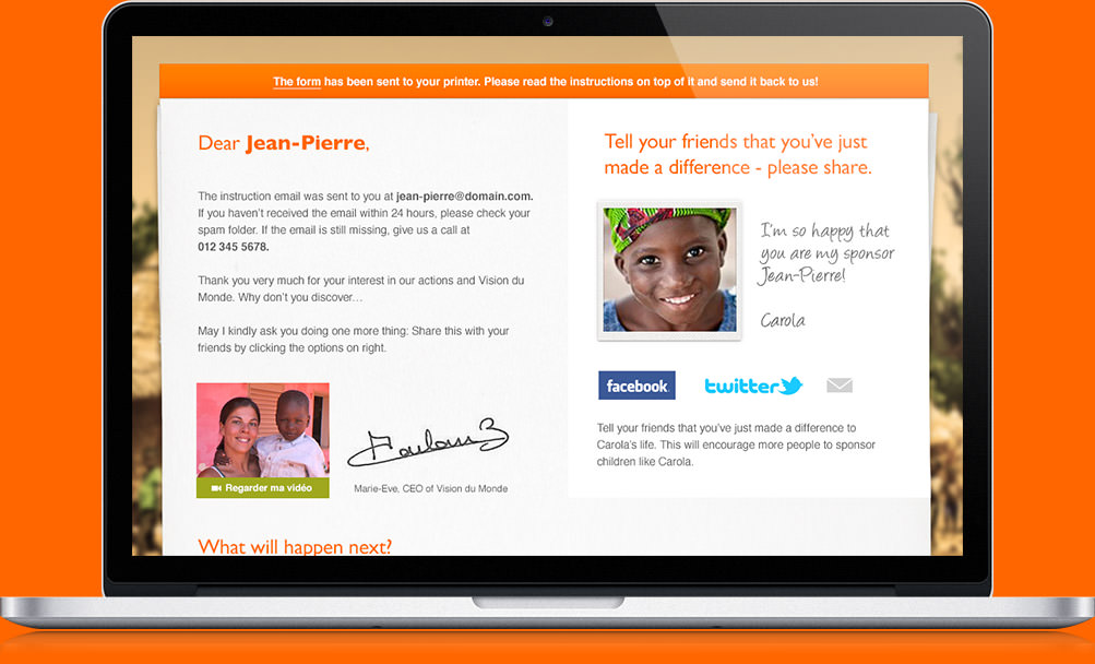
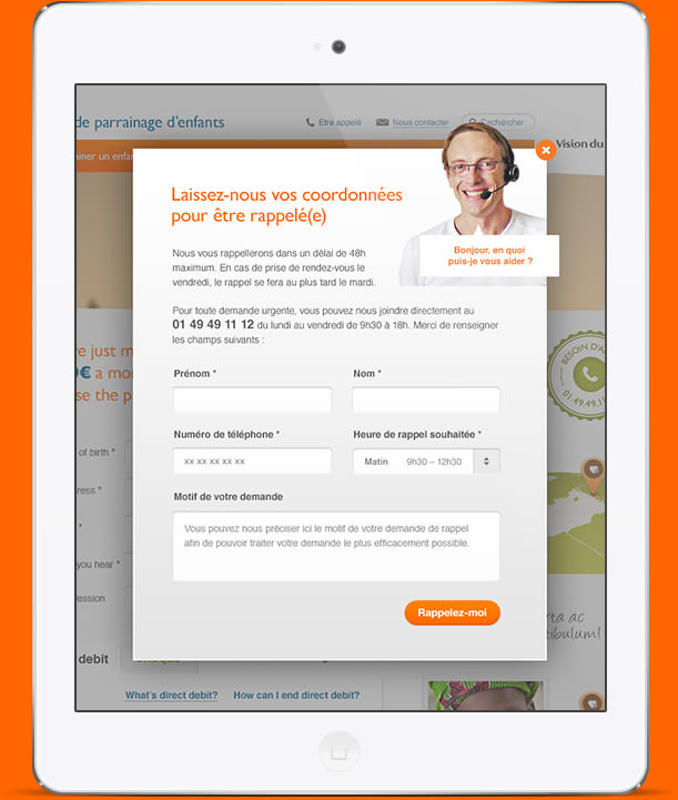
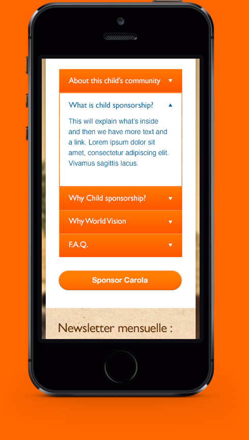
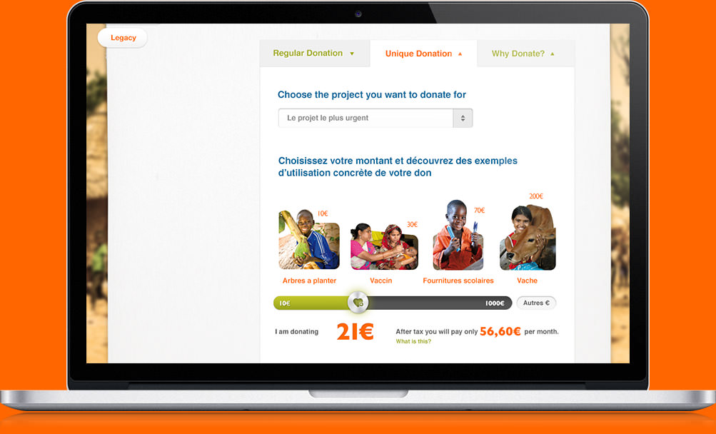
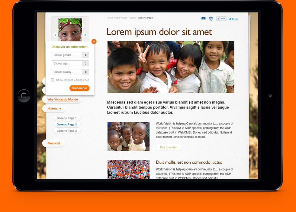
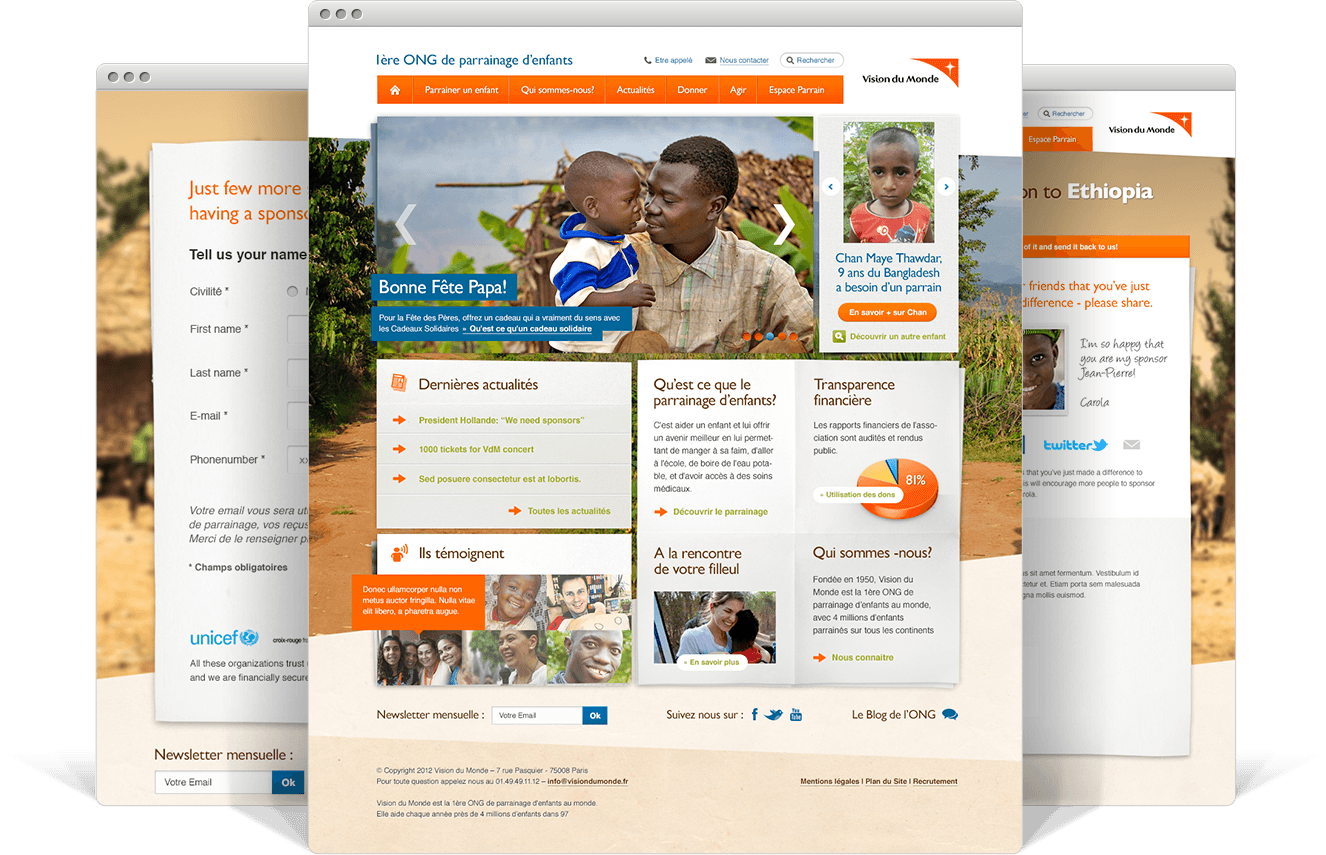
I started by giving the site a modern and strong visual look using a full-screen background image with boxed elements. The layout slowly started to evolve and elements eventually found their places nicely. There were a lot of pages to design: multiple steps of the sponsorship funnel, donation center pages, and several variations of generic subpages…
During the project I travelled to the Middle East and Africa to find some inspiration for the design – and I found it in Ethiopia. Being able to see first-hand what World Vision provides for children helped me really understand the bigger picture. It was one of those moments when everything clicked. The client loved the Ethiopian inspired touch and soon enough the homepage got approved with flying colors.
Eventually all the pages were approved, development was under way, and I returned back to Helsinki. I also helped out with CSS styling for the typography and coded some jQuery widgets, i.e. banner carousel, testimonial widget and the parallax background.
Development issues delayed the launch multiple times, but finally in October 2012 the site went live. The new design received a warm welcome internationally from other World Vision countries – and most importantly, from the French people. The Facebook post of the launch received positive feedback immediately, “Bravo!!!”, “The analyst programmer tells you: Amazing work indeed!”, “Congratulations to the team! Super!!!” – Yay!
What about the sponsor numbers? After we initially launched the redesign, sign-ups were slower than before as expected (the users needed to get used to the new site). But after a week, the citizens of France started to support children in developing countries more than ever – well done Team Obelix.
www.visiondumonde.fr